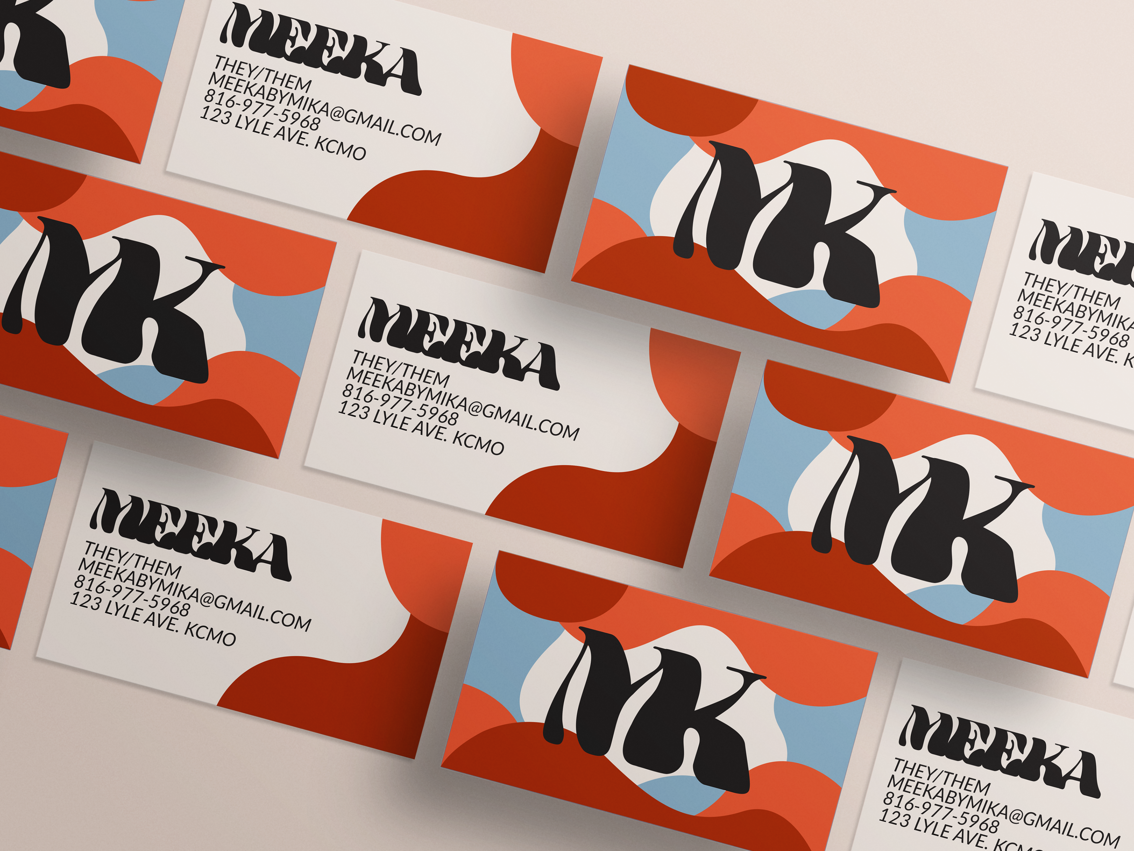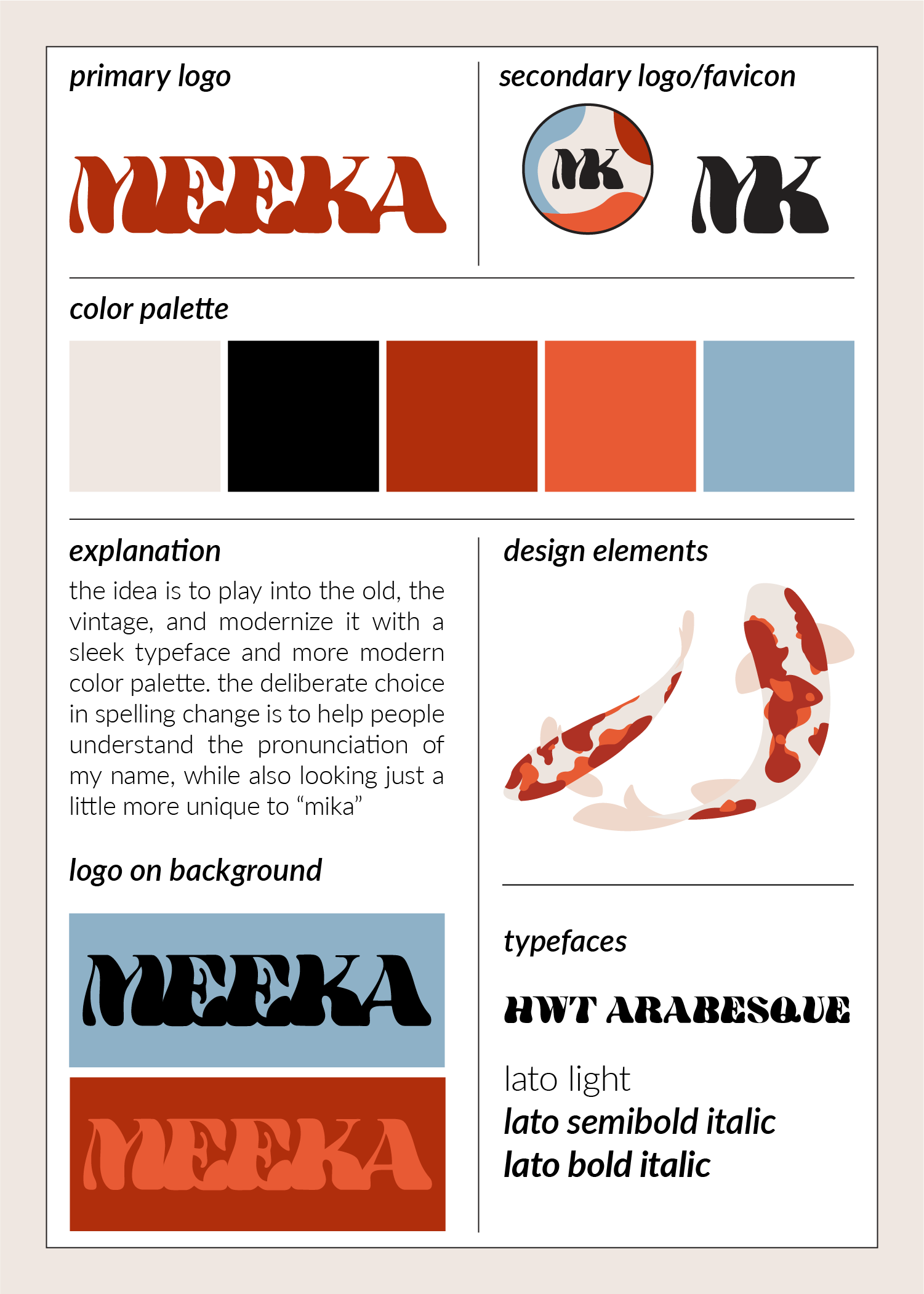
Self-Identity and Branding
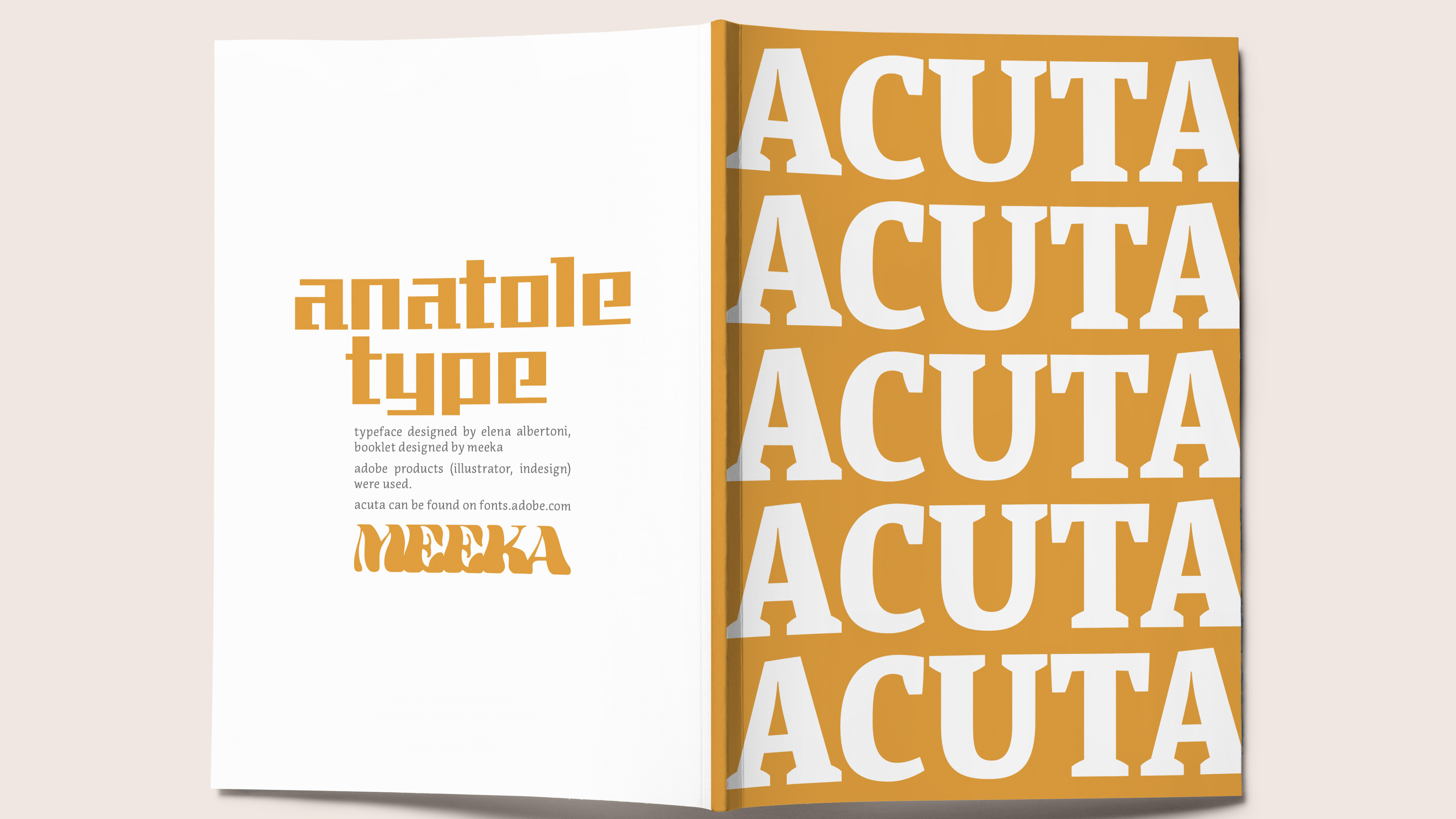
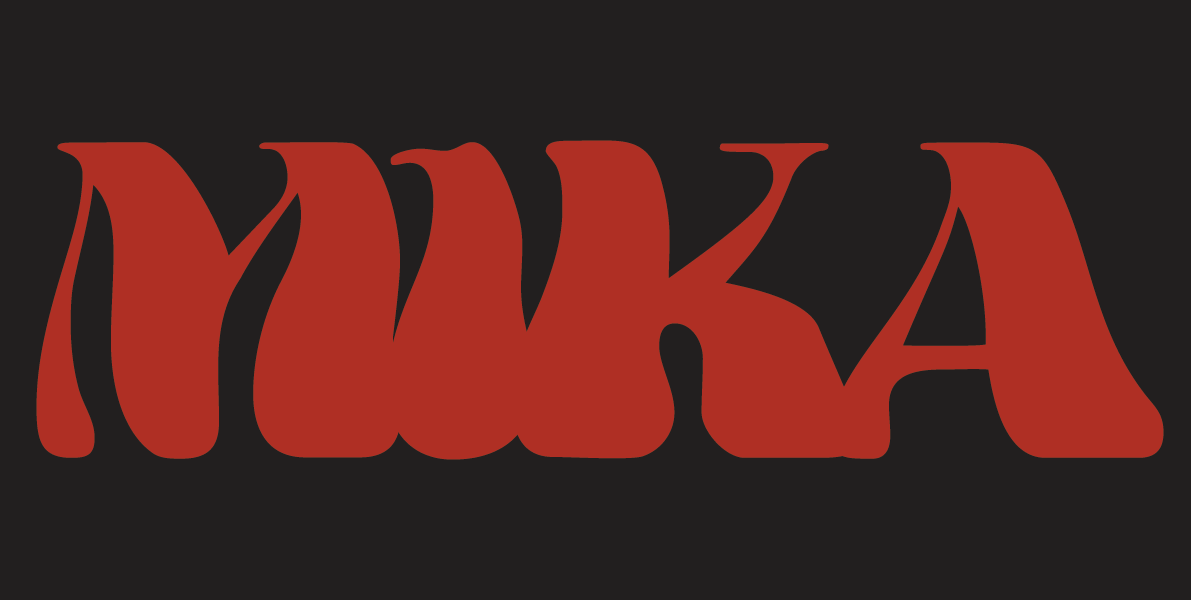
There is a short explanation in the guide as to the reason behind the name "Meeka". When I first started using Mika as my name to better align with my feelings of gender and self-identity, I had initially assumed no one could mistaken the pronunciation. That had soon become not the reality, so I decided to play on it for my branding. Meeka is not only the correct pronunciation of my name, acting as a guide to it, but fun visually and adds to my identity.
The color scheme had originally been more, vintage, I suppose. Blues, oranges, yellows. A brown, even. It didn't look bad, but it wasn't me. So I had done more digging and more concepts with the design, and settled for this red, orange, and a pop of blue. Koi fish are also my second favorite animals in existence (only beaten by cats, of course), so it felt only fitting that not only would I make them a design element of mine, but that they'd be a huge part of this color palette, too.
For the decision of color and how to choose, blue should only be used rarely as an accent, a pop of color. The main colors are the dark red and the red-black. The tan color is in place of white in my main designs, and the orange can be treated as a navigation color, perhaps, to lead your eyes from one to the next.